

 The title of the film 'Social Suicide' is conventional of thrillers because the use of the word suicide implies to the viewer that the film is likely to be a either a thriller or horror as it creates a dark sense to the film from the beginning. We also chose to incorporate a social theme in the title by naming it 'Social Suicide' because the story line of the film is based on social networking through the internet and by phone. Our film title is similar to the modern film 'The Social Network', which is not a thriller but also explores the theme of social networking.
For the the title we used a red font with a white background. Although it is more conventional for thrillers to have a dark background, especially when an there is an element of horror in the film, we chose a white background because we filmed our opening during the day and a dark background may distract the viewer from what is happening in the opening. Another reason we chose to have a white background is because the colour white is associated with mental institutions, which helps convey to the audience that Alice may be mentally unstable. The red font is conventional for thrillers and horrors because it symbolizes blood, and therefore implies the film may be gory and include horror. This American Psycho title page is similar in terms of the colours used.
The setting for our opening is in school which is conventional for thrillers aimed at a similar age group as ours because many teenagers are in education, so they can relate to the film more when it is in this setting. The costumes in our opening are also conventional for thrillers because the victim is dressed in white which conveys her innocence to the audience and suggests that she may be the victim, and the villain is dressed in all black which suggests he is a 'dark' or evil character. It is also difficult to see the villain's face clearly in the opening which makes him mysterious to the audience and therefore suspicious of him. A gun is used as a prop for the villain which conveys to the audience that he is perhaps dangerous and evokes a sense of fear in the audience which also connotes that he may be the villain.
 We decided to use close ups of Alice's eyes in the beginning of our opening. We did this because close-ups of eyes are very conventional of thrillers so it helps to convey the genre of the film and because it is usually the villain's eyes that are shown it implies that Alice may actually be the villain, as the villain is a figure of her imagination.
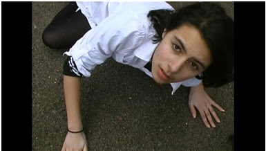
 A low angle point-of-view shot is used to introduce the villain which conveys his power and dominance over Alice to the audience.
A high angle shot is used to convey the victim's vulnerability and heighten the villain's superiority.
No comments:
Post a Comment